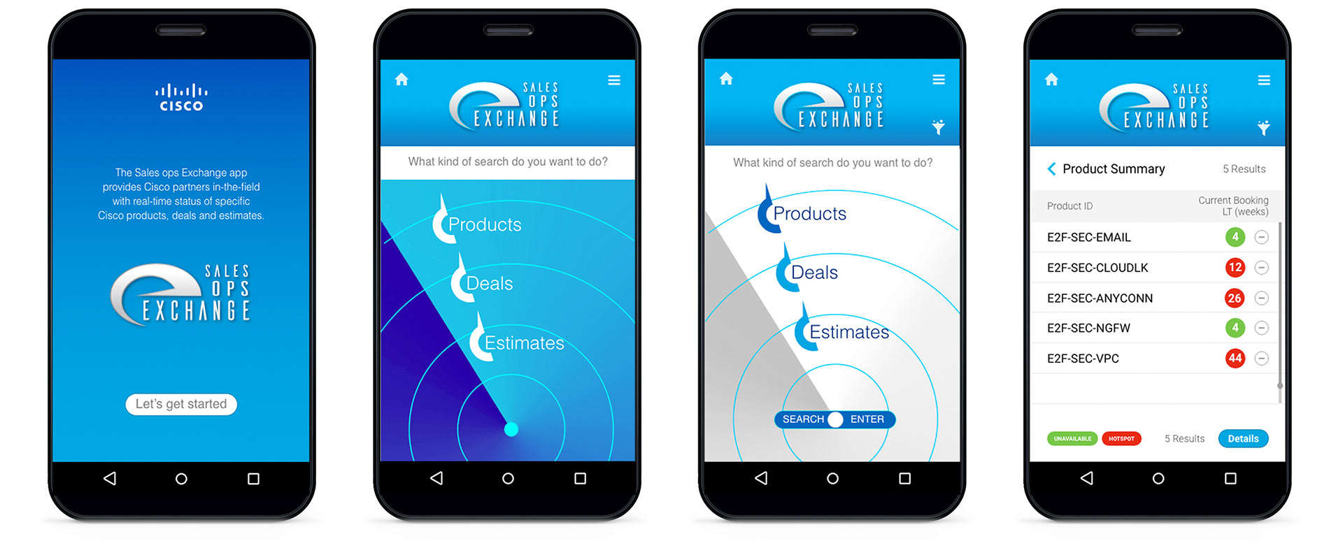
This mobile app prototype was designed on-the-fly in response to an immediate demand for products resulting from the Covid-19 pandemic of 2020. It features 76 interactive screens providing Cisco partners and field sales teams with real-time visibility of product availability and status. Adobe XD software was used to provide stakeholders and dev with an interactive prototype.
Before and after samples demonstrates how visual fatigue is reduced so user engagement increases. The added white space creates a consistent under-lying grid to organize and tame an overwhelming amount of data.
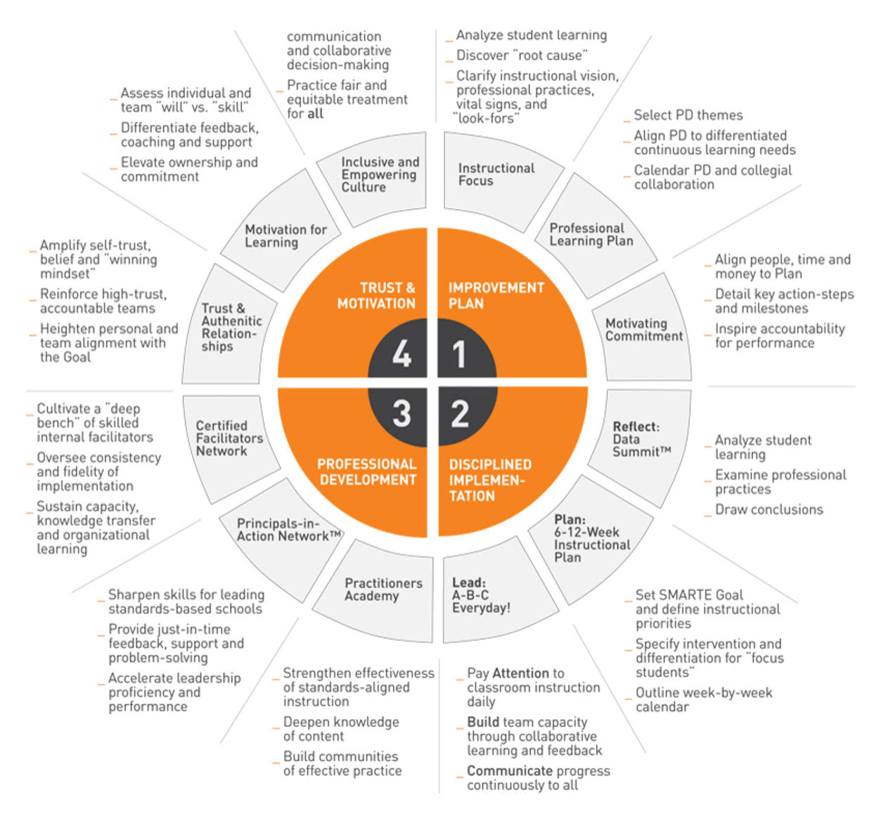
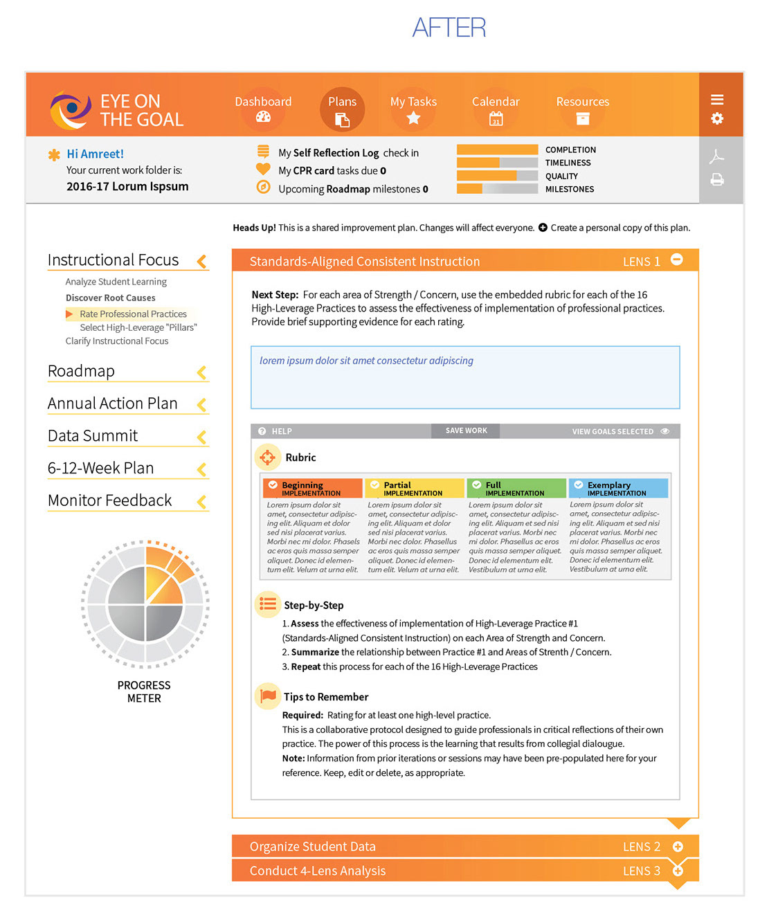
“Eye On The Goal” is an online portal designed to empower the teachers and administrators of entire school districts with a set of tools designed to facilitate and align collaborative improvements in teaching, learning and leading.
The tool is a complex framework with several tasks in each of the
12 sections.
12 sections.
Keeping users engaged was the challenge at-hand. The confusing and overwhelming interface contributed to confusion and visual fatigue. A clear and predictable presentation of complex content was essential.
For starters, all fonts were changed to a single font family with Open Sans Light as the primary font.

Establishing a 3 column underlying grid helps organize content predictably. Ample white space provides visual pause and groups related elements in functional groups. This contributes to user confidence and efficiency of motions.
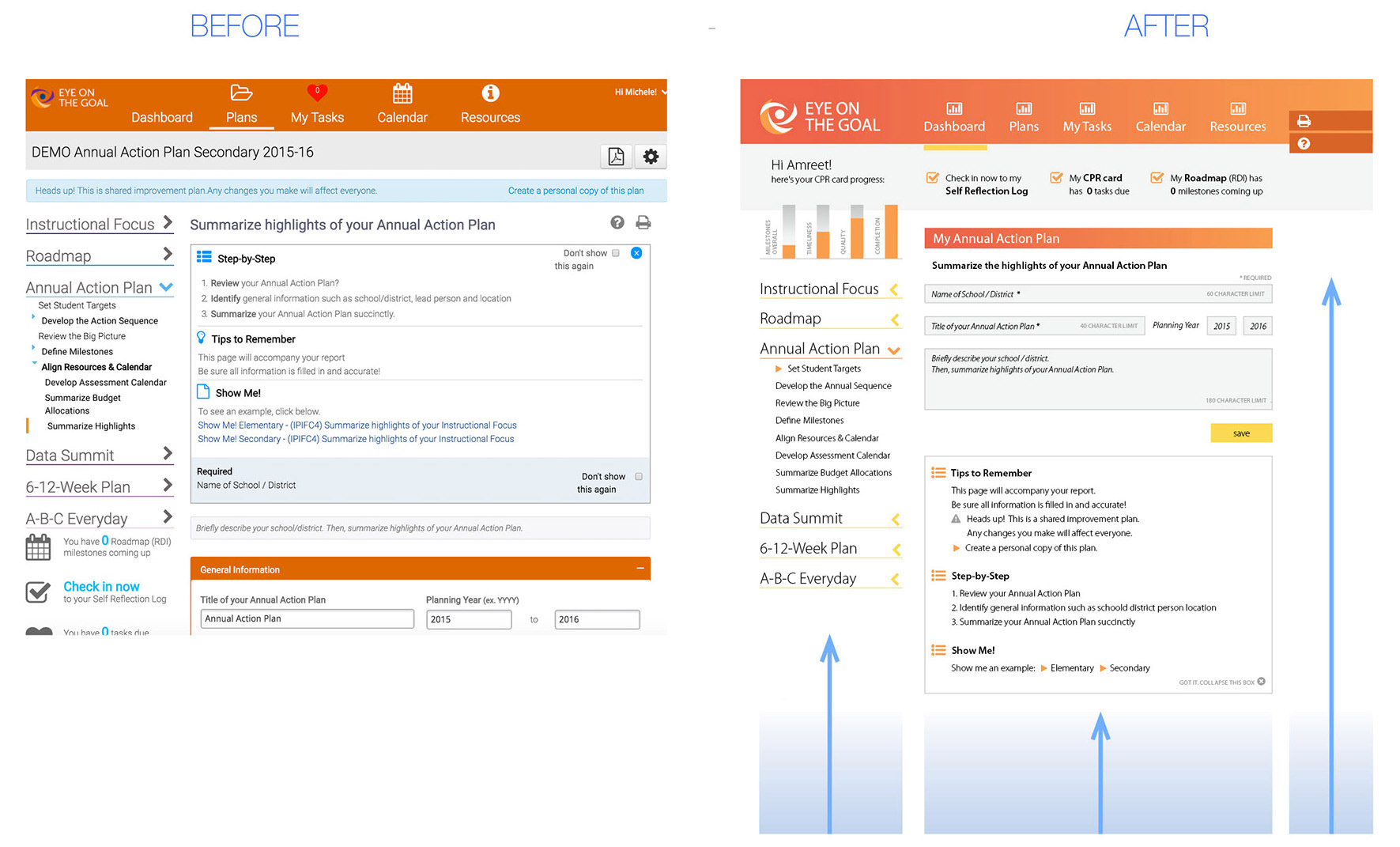
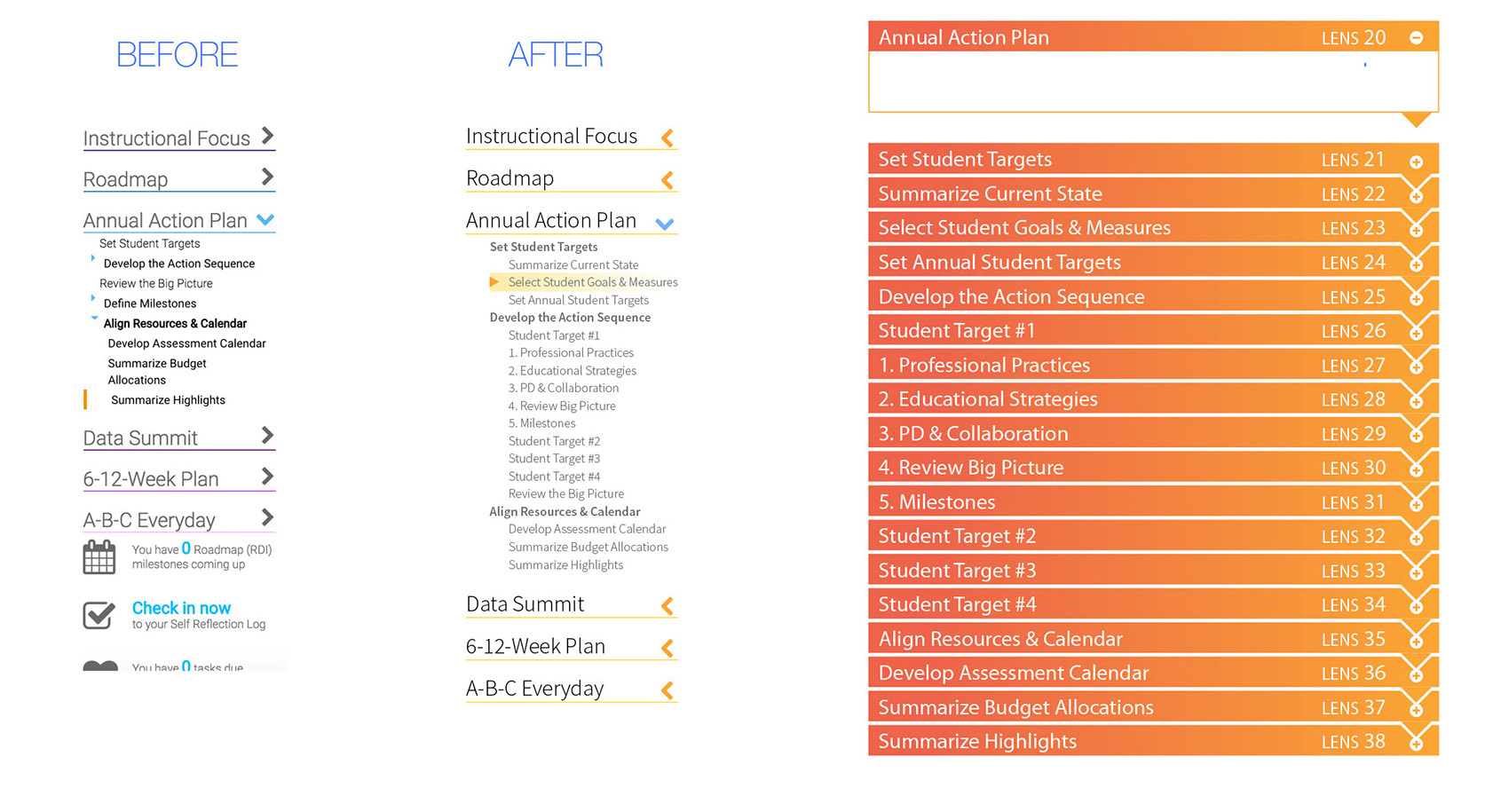
Vertical menu revisions improve typographic legibility and help the user understand current position within the sequence of modules.
Section headers (orange) appear to be interlocking. Sections expand and contract with an accordion motion to maintain focus on one task at a time.
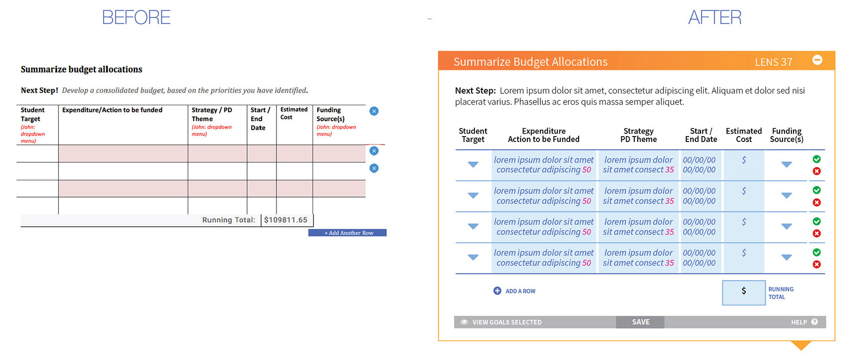
The orange bar indicates the section title and lens number. Followed by instructions with increased legibility. User input is consistently indicated in light blue.
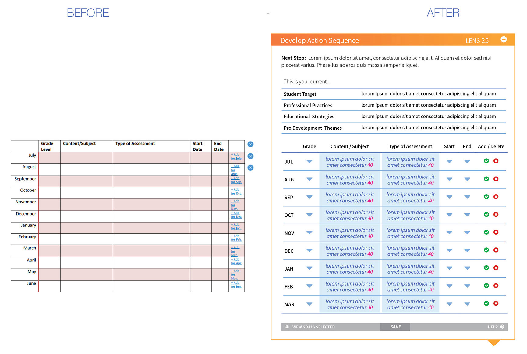
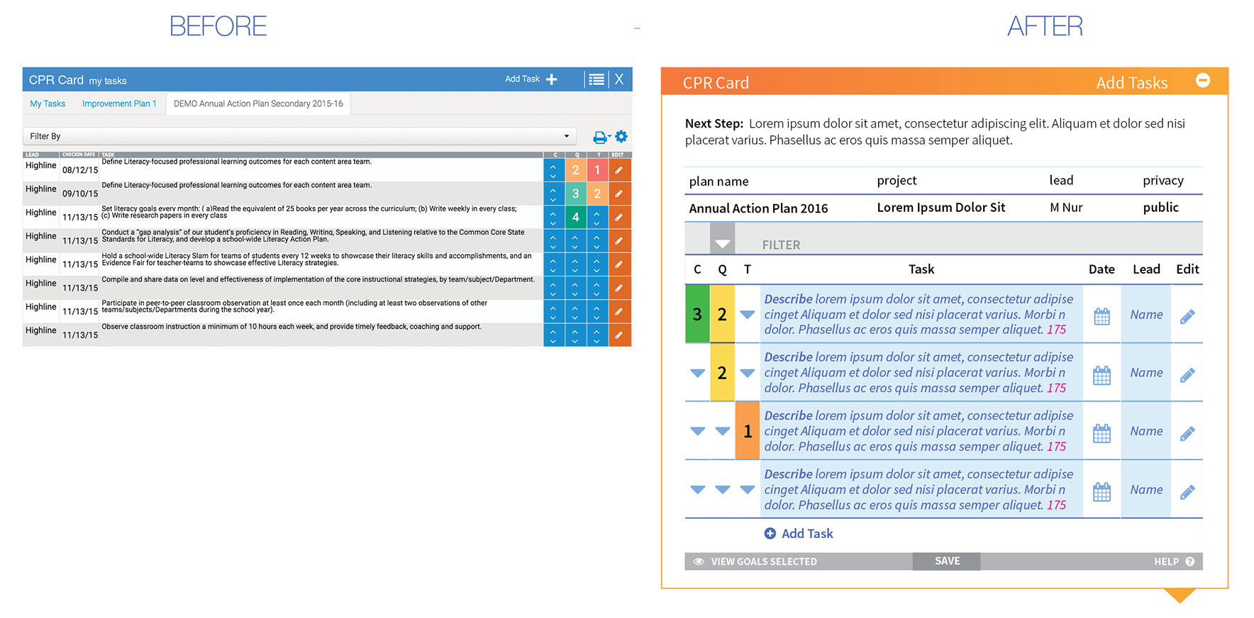
The same table style applied to other lenses.
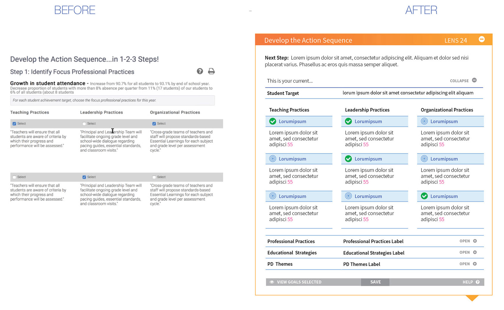
The help section was relocated below the blue user input area. A collapsible display minimizes clutter, while the most relevant information remains accessible.
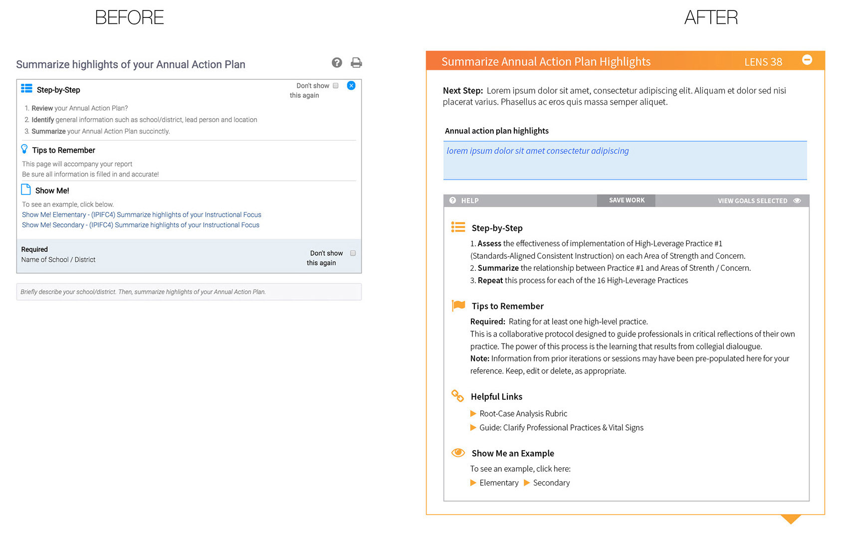
By rearranging the sequence of columns, resizing columns, revising colors and enlarging fonts and user tasks were completed with fewer clicks and results became visible at-a-glance.
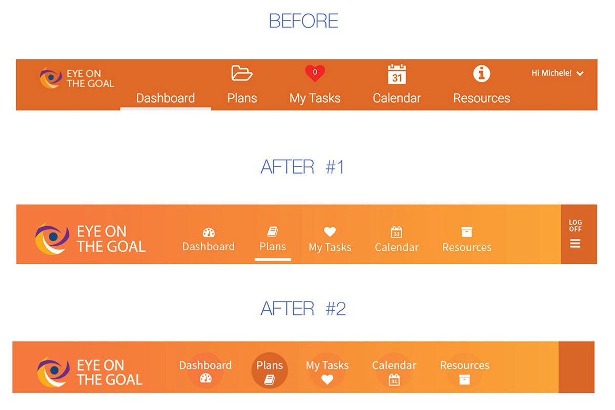
The horizontal navigation bar was visually disjointed.
Icons were styled and sized more consistently.
Grouping was implied with spacing.
Cleaner colors helped pop the logo and move the eye horizontally.
Icons were styled and sized more consistently.
Grouping was implied with spacing.
Cleaner colors helped pop the logo and move the eye horizontally.
Visual hierarchy helps users "digest" content in an intentional sequence. Ample white space provides visual pause.
Again: Ample white space provides visual pause and groups related elements in functional groups. This contributes to user confidence and efficiency of motions.
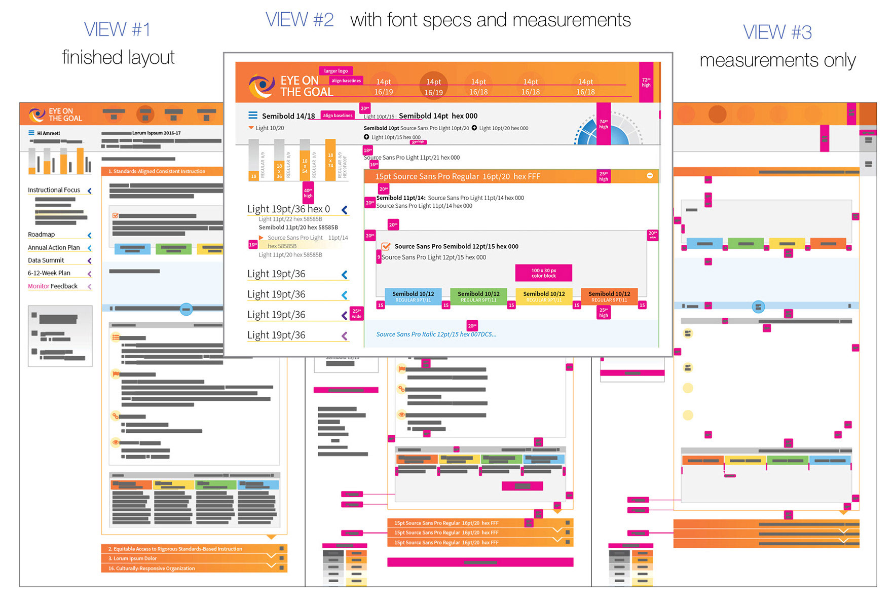
Developer specs provided in three views. This was in 2017, before Adobe XD came along.